If your product photos aren’t getting the clicks (or the sales) you expected, it’s usually not the camera. It’s composition. Composition is what makes someone pause, feel the product, and think, “Yep, this is worth it.” And for busy CPG brands, that moment matters. A stronger composition can lift scroll-stopping power, improve ad CTR, and make your product pages feel instantly more premium. Even better: composition is fixable. Fast. Below are 7 product photography composition techniques we use to create product photos that convert (and product photos you love). They’re simple, repeatable, and designed for real-world brand content.
Why Composition Matters (More Than You Think)
In marketing terms, composition is your “first impression lever.” It helps your product:
- look higher quality (even before someone reads a word)
- feel more on-brand and consistent
- stand out against competitors in a crowded feed
- guide the eye to your key selling point (flavor, texture, label, benefit)
And when visuals are easier to read and more enjoyable to look at, people stay longer. One HubSpot-cited stat often shared in marketing circles: content with relevant images can receive 94% more views than content without.
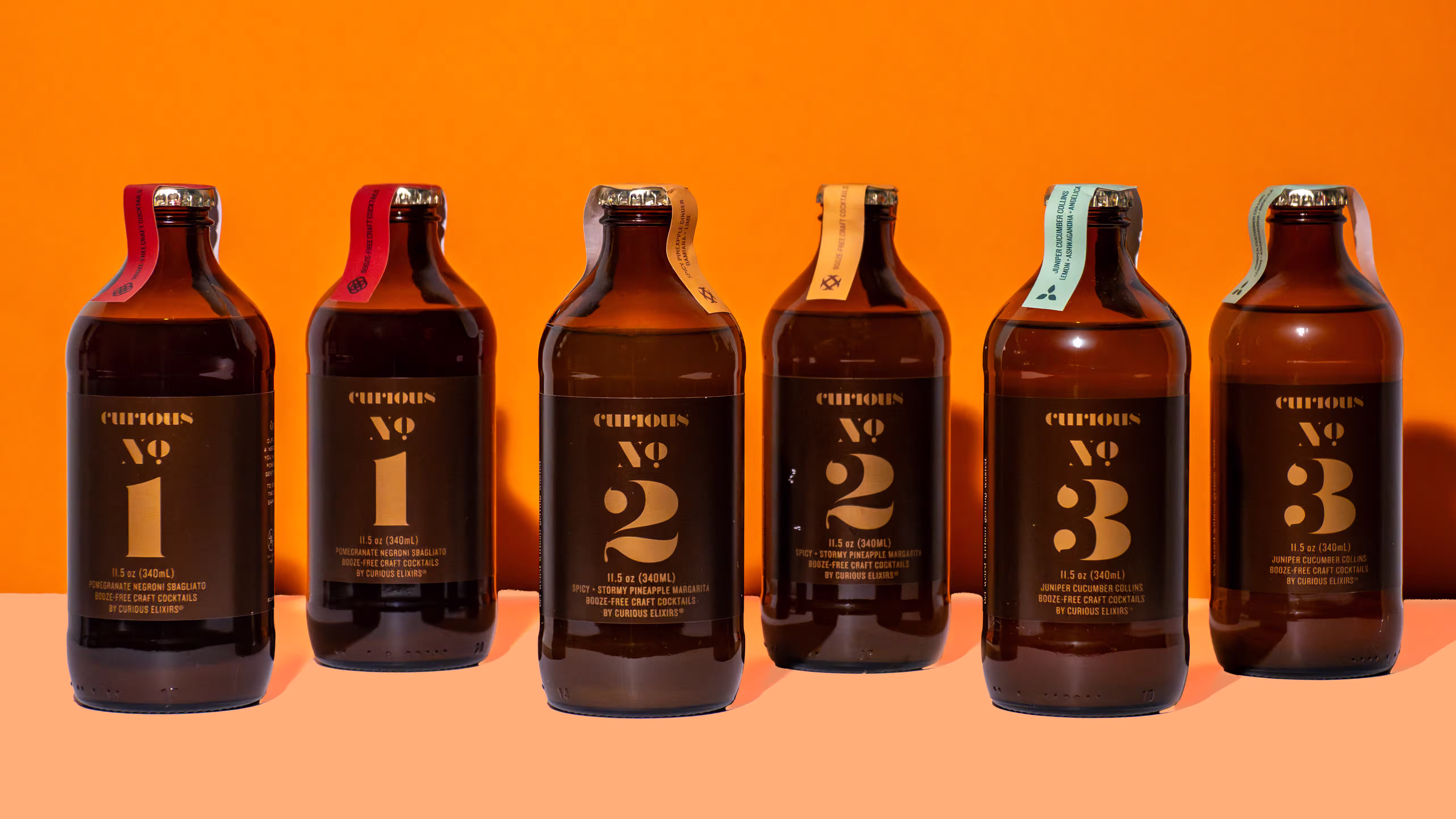
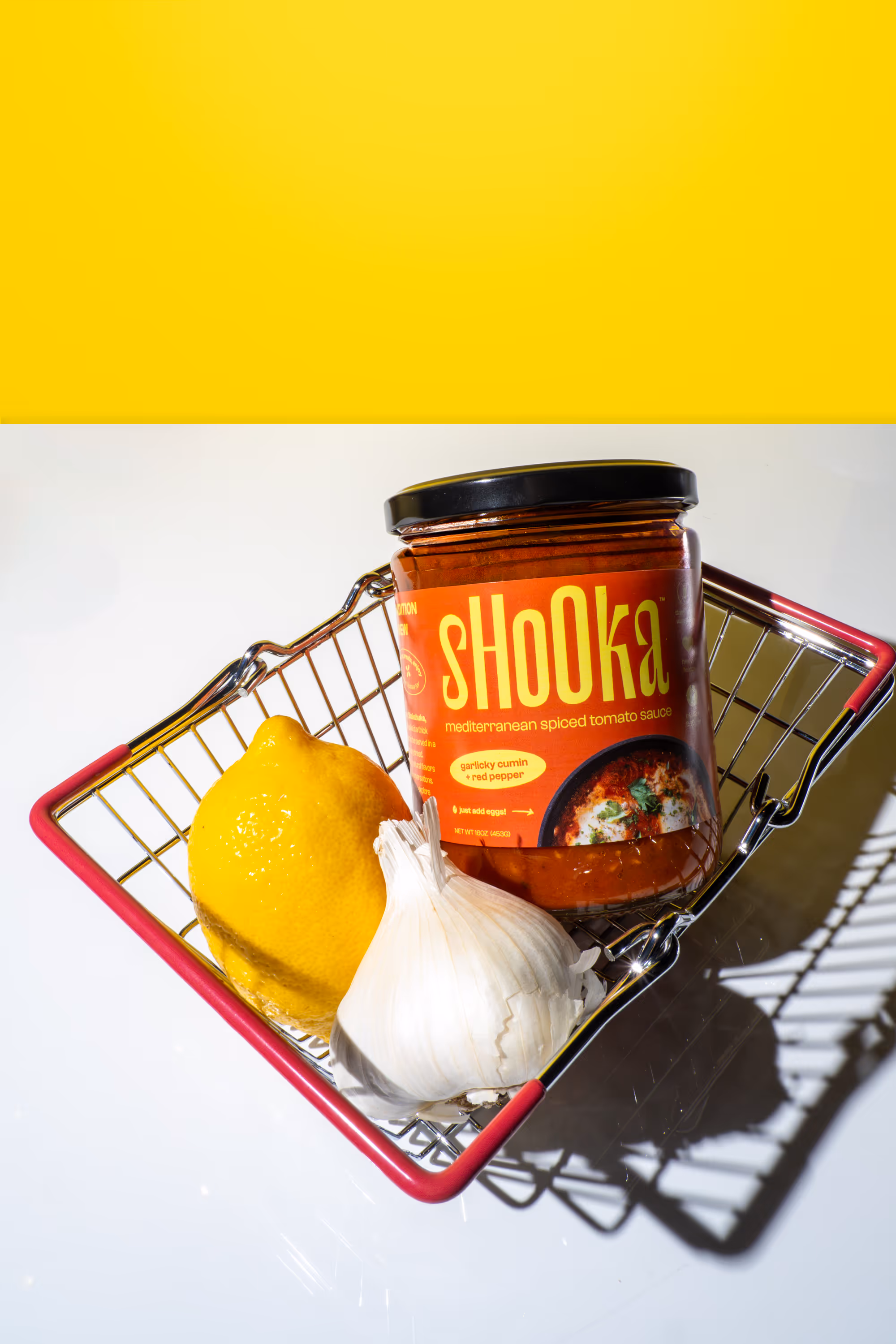
1) Rule of Thirds (The “Instant Upgrade”)
The rule of thirds is the fastest way to make a product shot feel intentional. Imagine your frame split into a 3×3 grid. Place your product on one of the vertical lines (or at an intersection point) instead of dead center.
Why it works: It adds energy. It feels modern. And it gives your eye somewhere to move.
Try this for CPG:
- Put the product slightly off-center
- Leave space for text overlays (perfect for paid social)
- Place the logo near a “power point” intersection
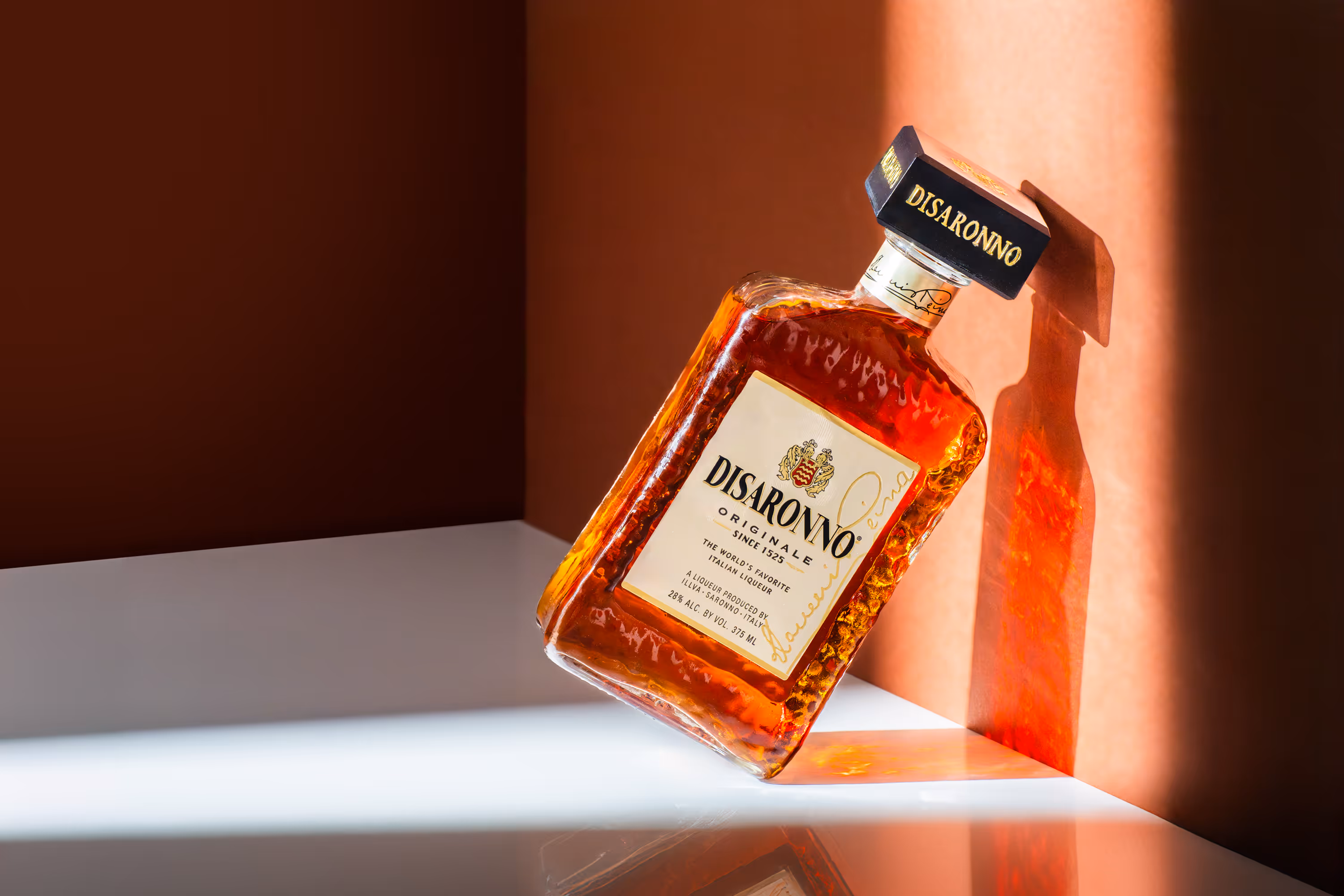
2) Negative Space (Make the Product Feel Premium)
Negative space is the empty breathing room around your product. It’s not wasted space – it’s focus.
Why it works: Minimal compositions feel premium and confident. They also make your product easier to understand at a glance (especially on mobile).
Use negative space when:
- you want a clean, elevated look
- the packaging design is already strong
- you need room for a headline or product benefits
Pro tip: If you’re shooting for ads, negative space is basically built-in design real estate.
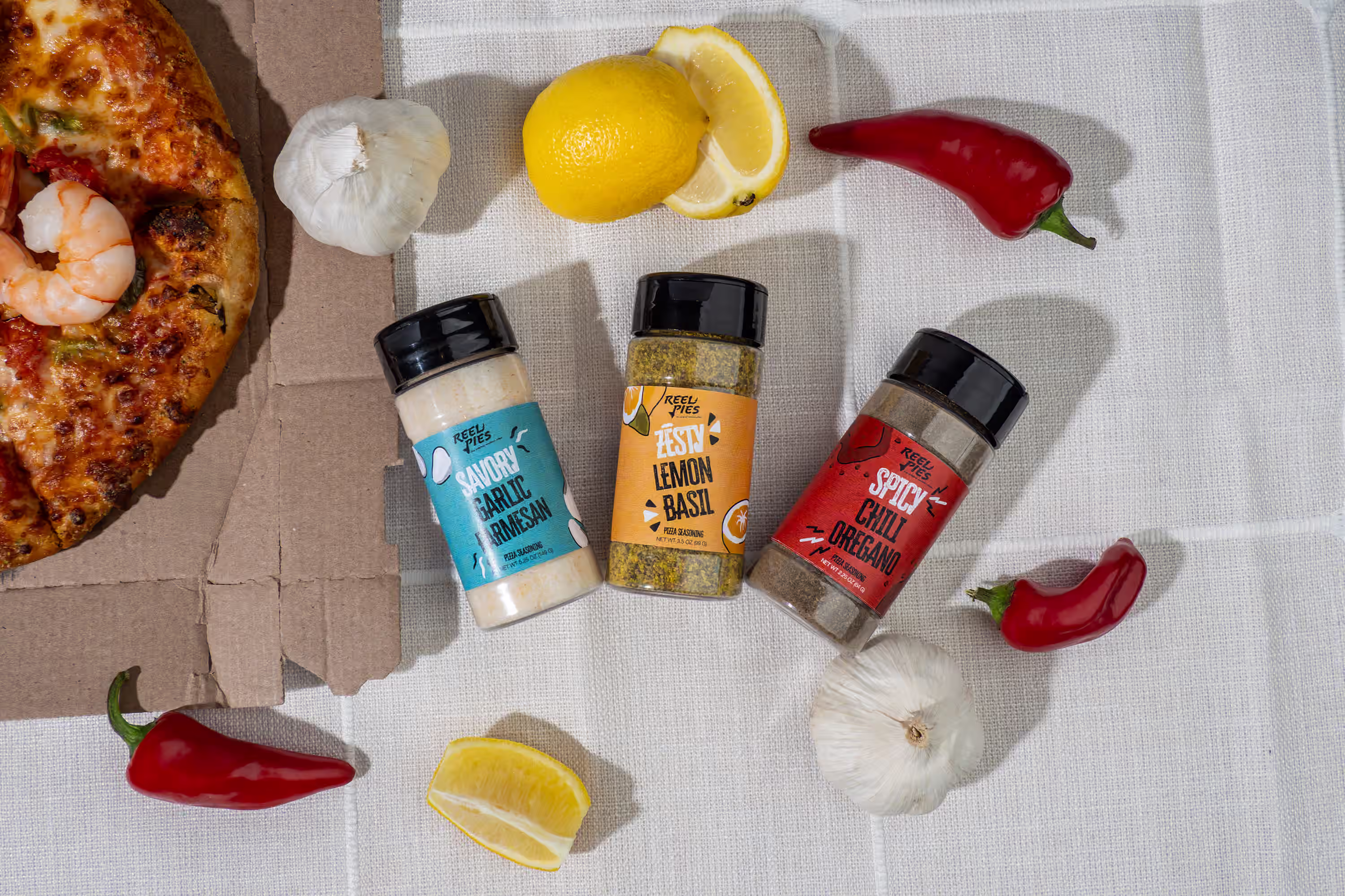
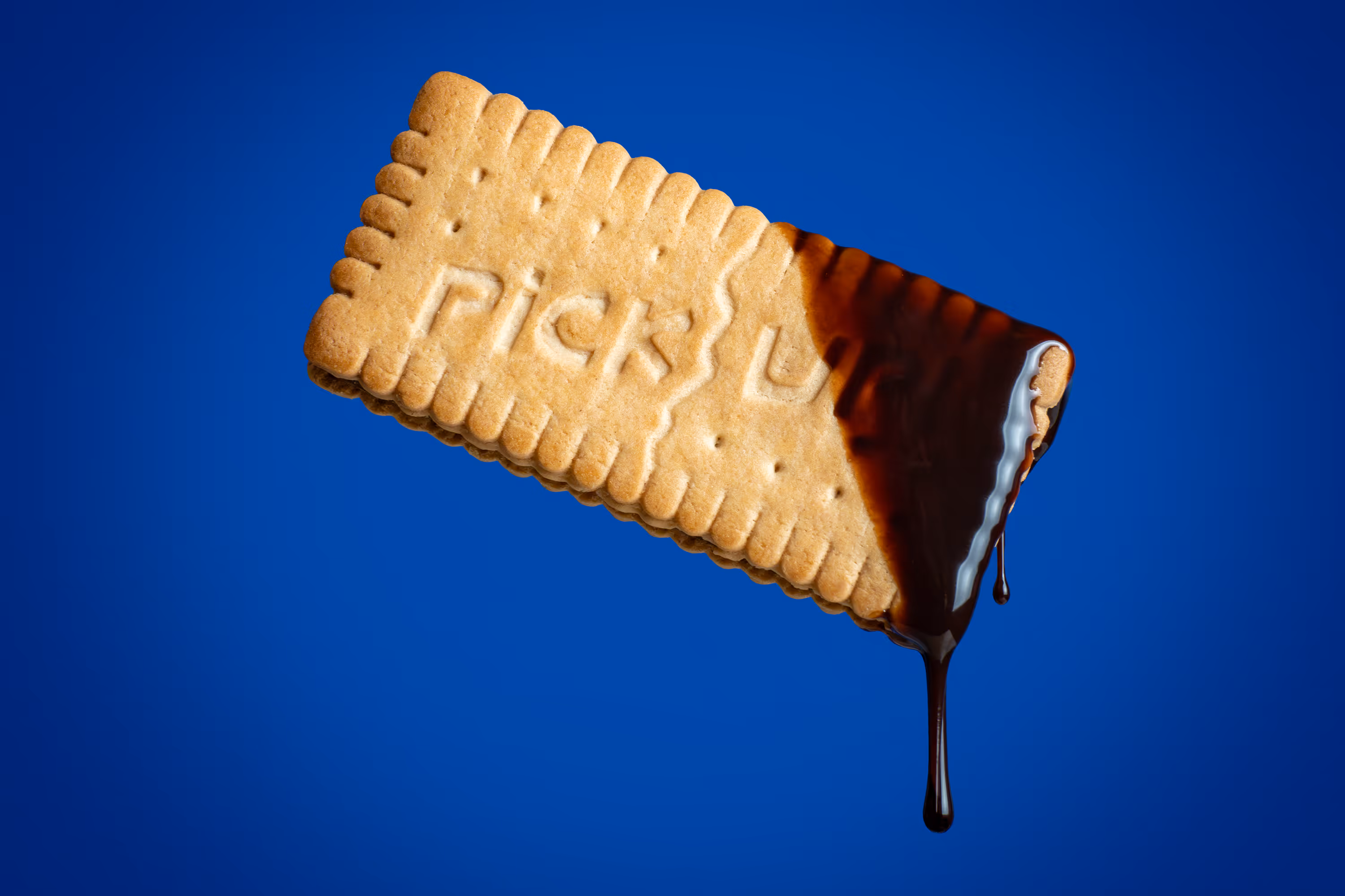
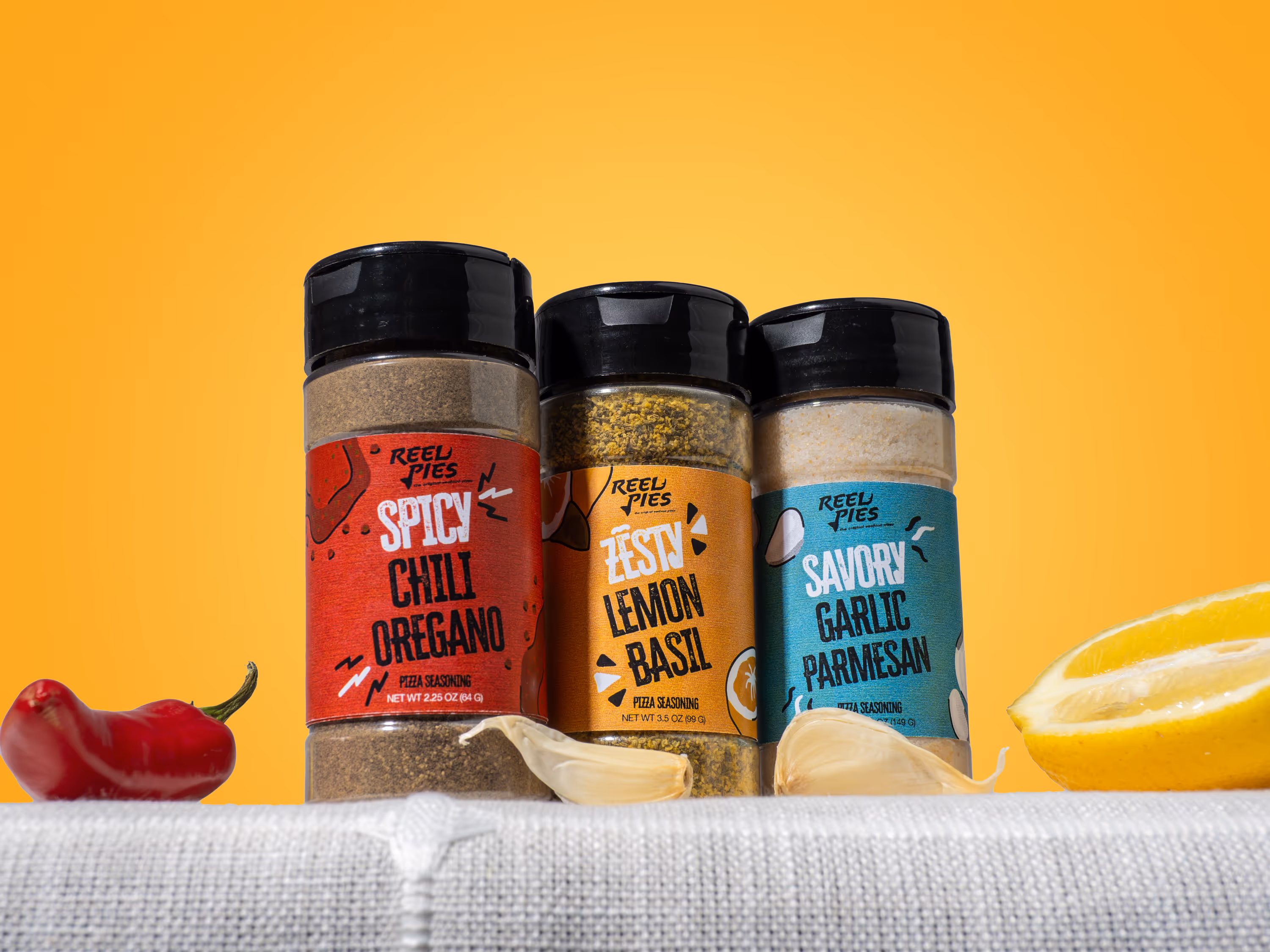
3) Leading Lines (Control Where People Look)
Leading lines are lines in your scene that guide the viewer’s eye toward your product. They can be obvious (a tabletop edge) or subtle (a drizzle of syrup).
Why it works: It keeps attention on the product longer, without forcing it.
Easy ways to create leading lines:
- a cloth fold pointing toward the label
- ingredients arranged like arrows (citrus slices, coffee beans, herbs)
- a pour line that directs focus to the logo
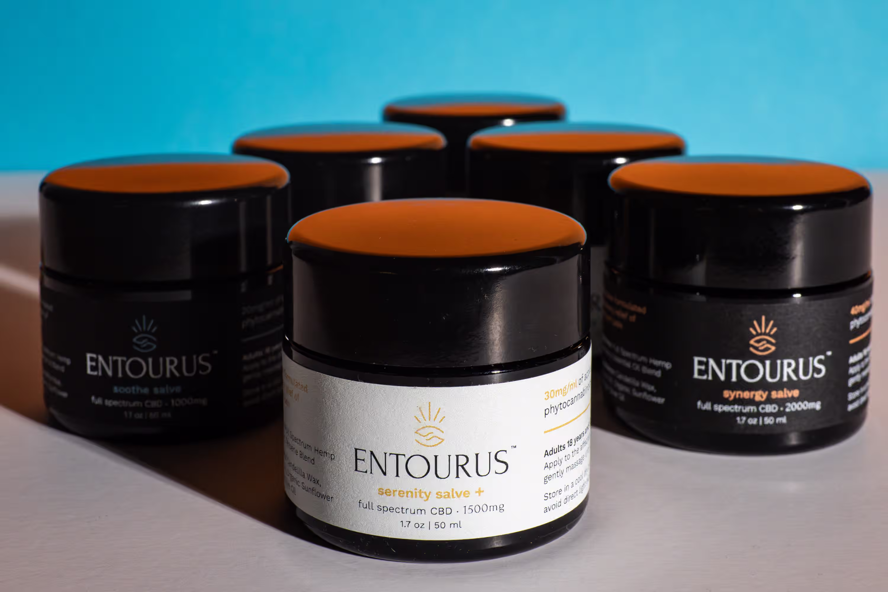
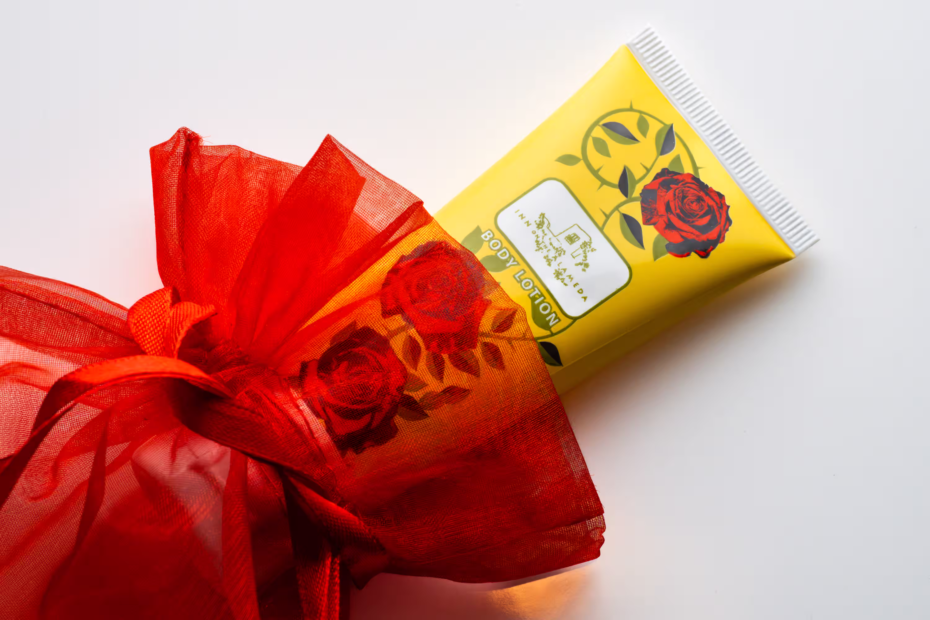
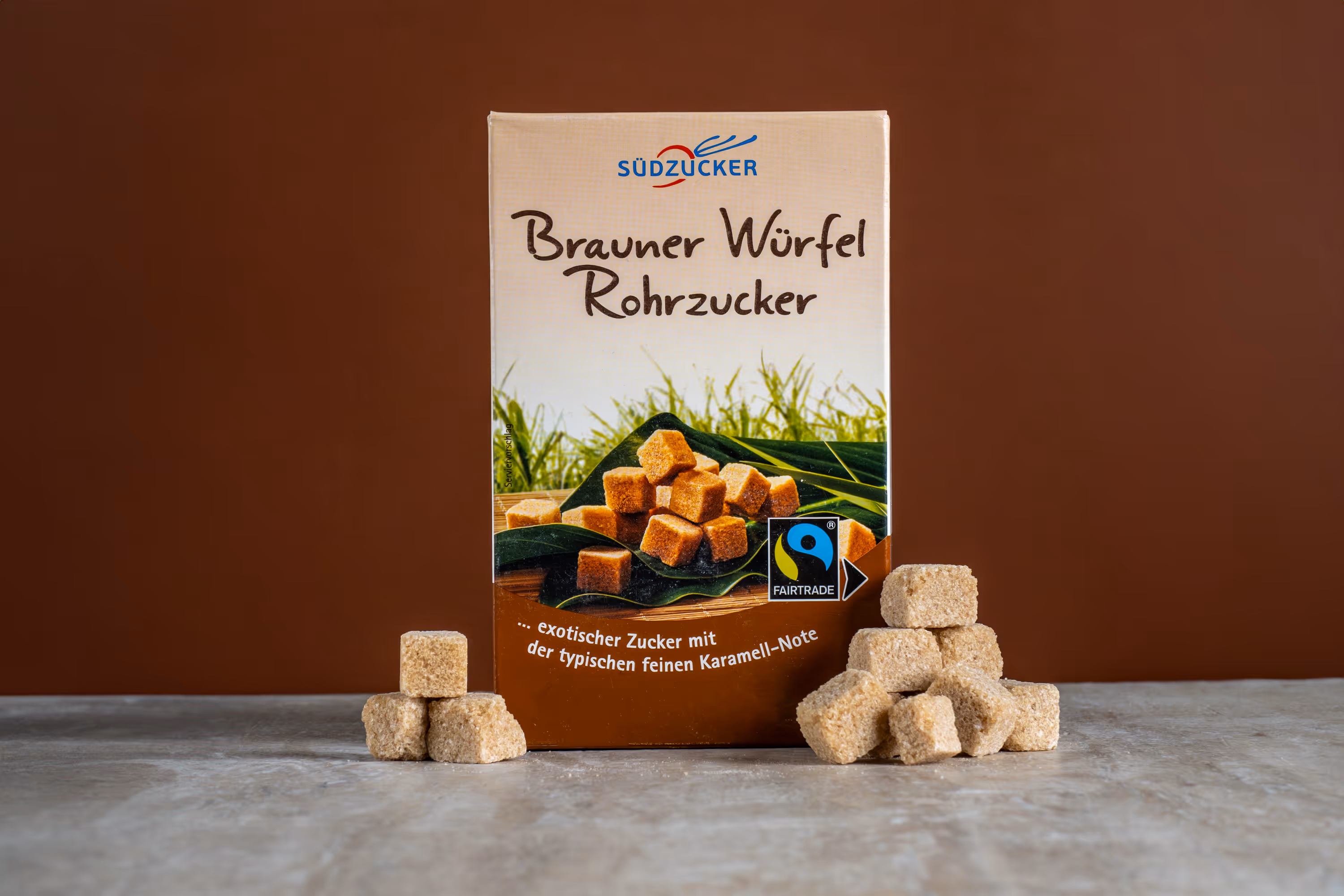
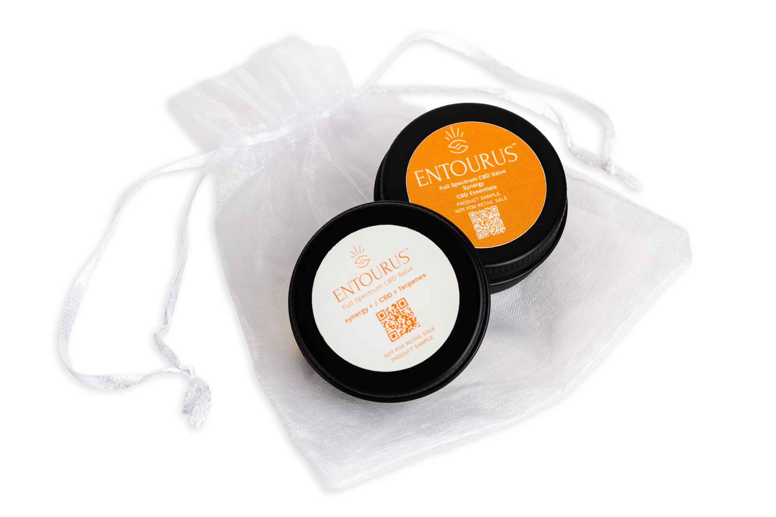
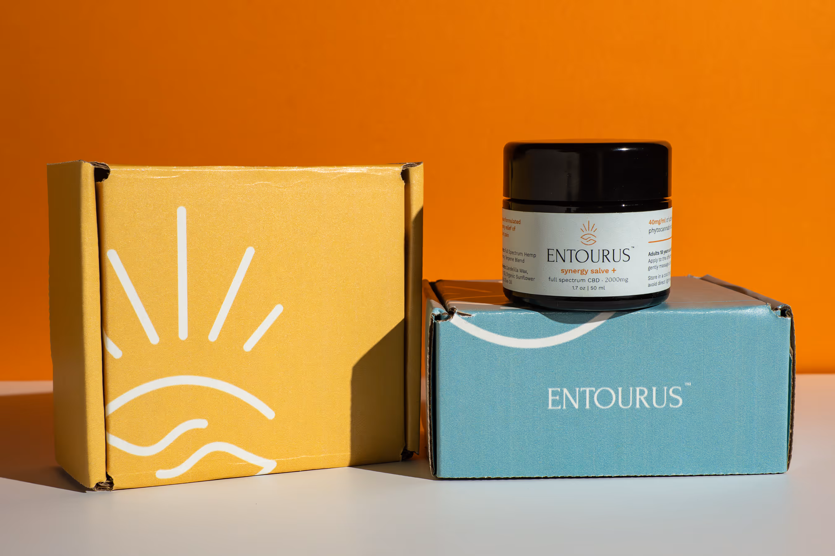
4) Symmetry (Perfect for “Clean + Trustworthy” Brands)
Symmetry is when both sides of the frame feel balanced. It’s simple. It’s satisfying. It screams “organized and reliable”, which is huge for wellness, skincare, and supplements.
Why it works: Symmetry feels calming. It builds trust. And it looks great in ecommerce grids.
Use symmetry for:
- centered bottle shots
- product + box pairings
- ingredient layouts (even spacing, mirrored sides)
Bonus move: Add one small “break” in the symmetry (like a single ingredient out of place) for a modern edge.
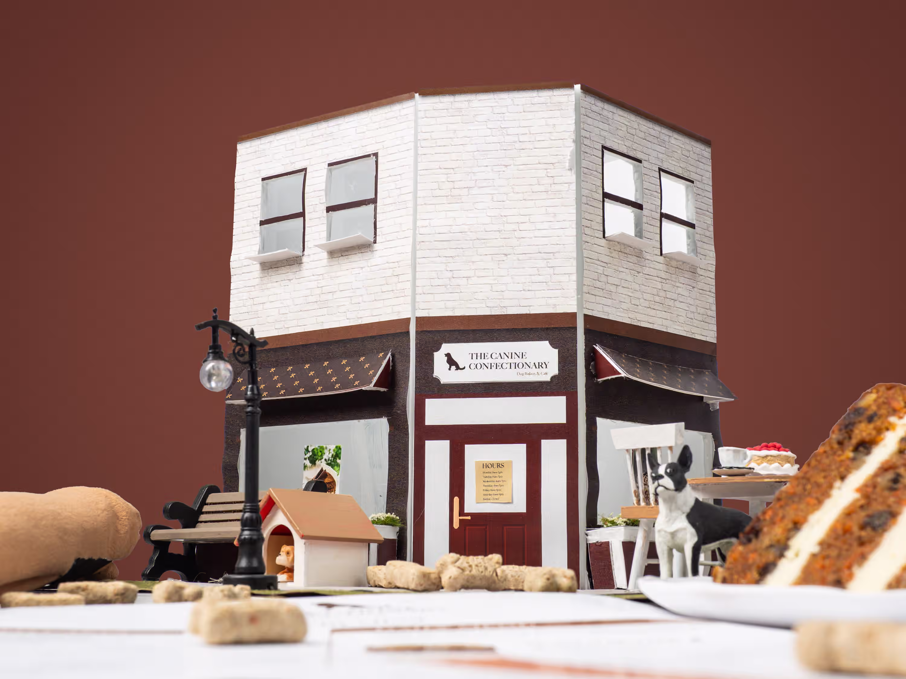
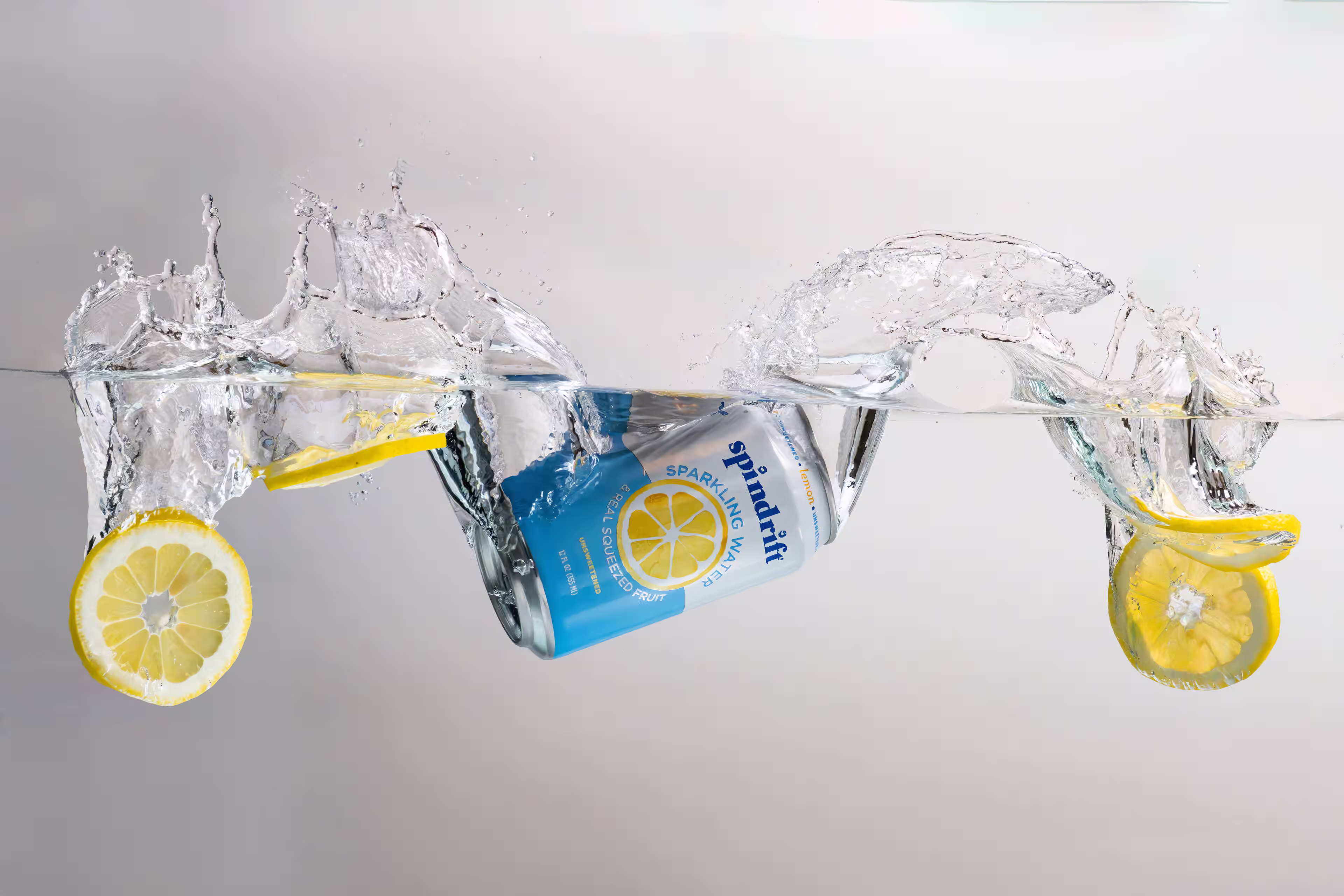
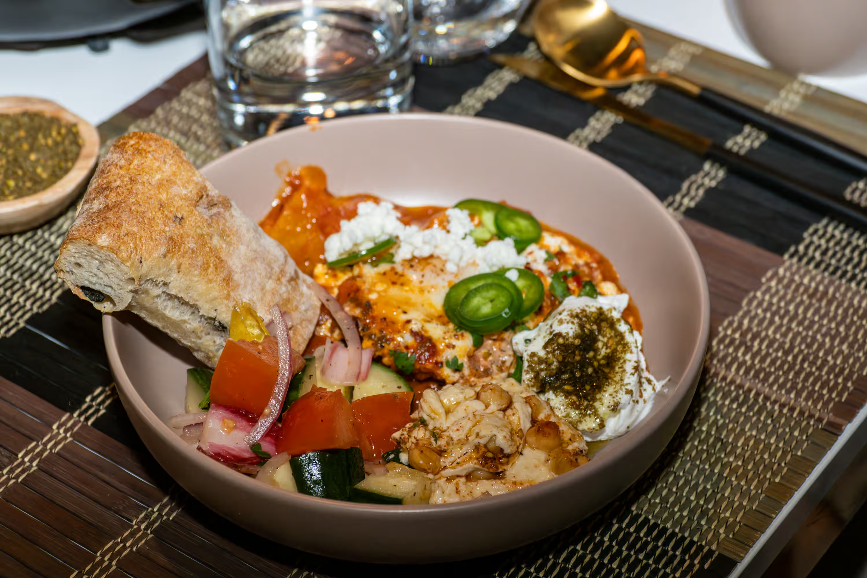
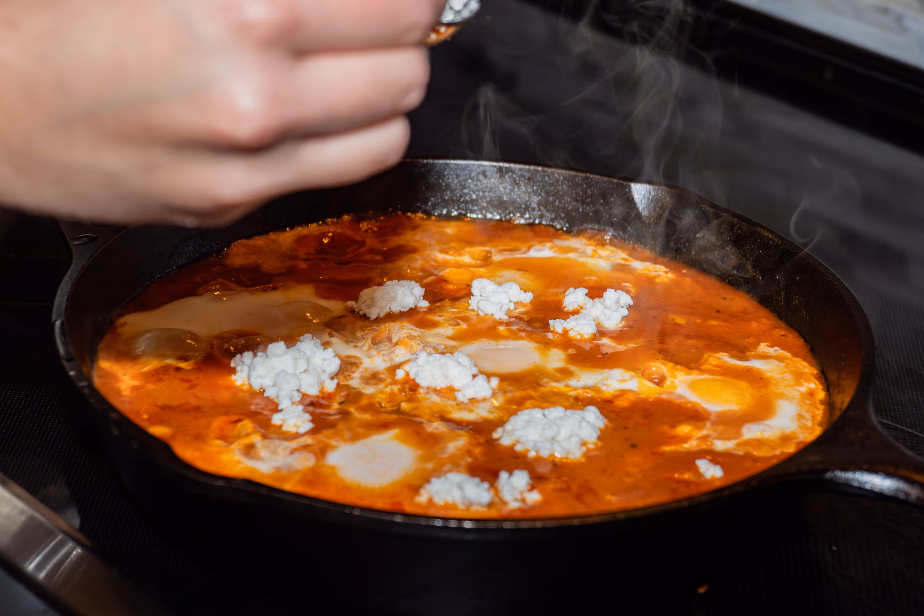
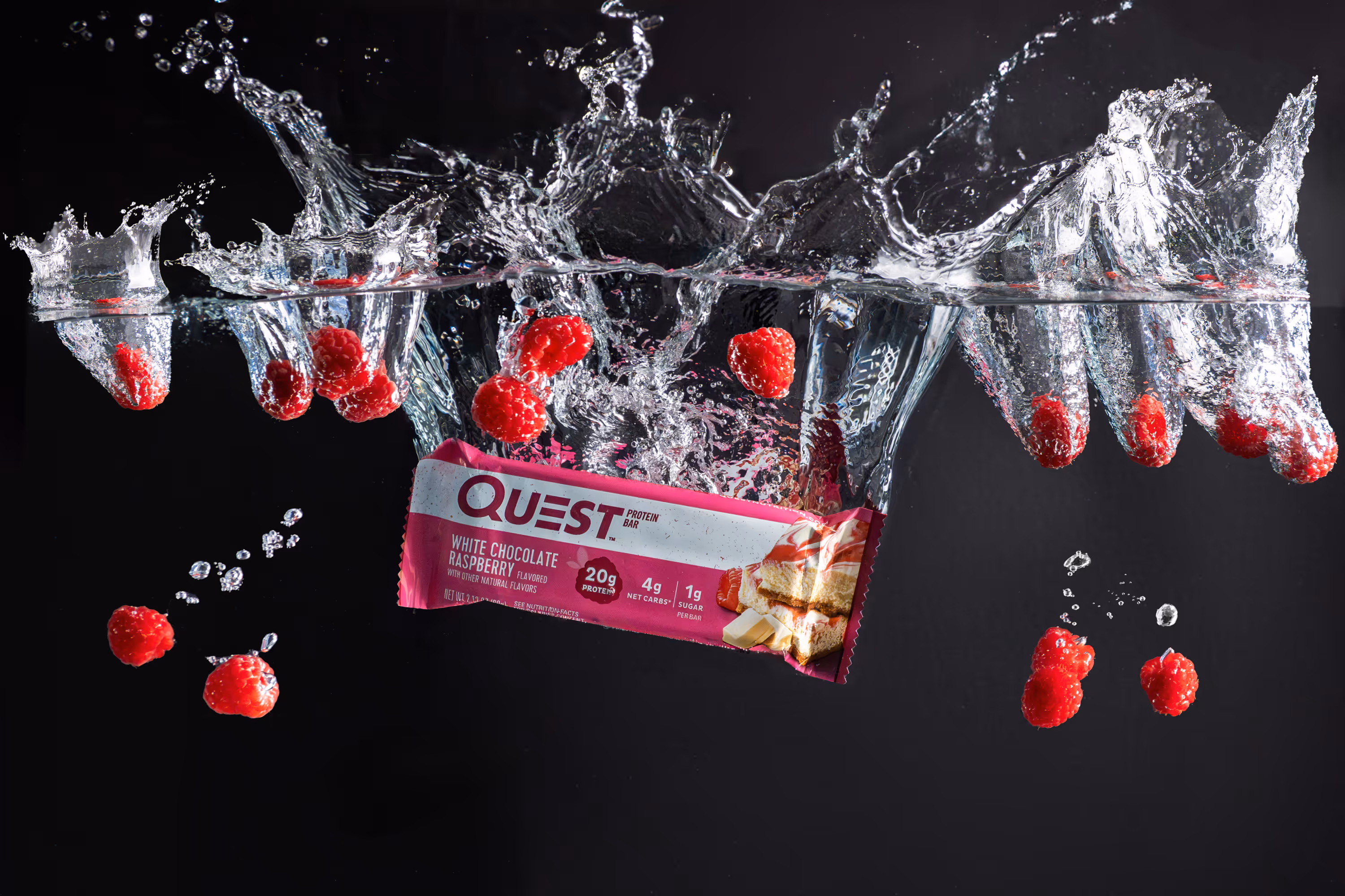
5) Depth + Layering (Make Flat Products Feel 3D)
If your shots feel “flat,” layering is your fix. Depth is created by placing elements:
- in the foreground
- around the product
- and in the background
Why it works: It adds realism and richness, especially for food and beverage.
Layering ideas for CPG:
- foreground ingredient blur (herbs, berries, spices)
- background texture (tile, wood, paper, linen)
- mid-ground props that support the story (glassware, utensils)
Pro tip: Use a wider aperture (like f/2.8–f/4) for gentle blur and a premium feel.

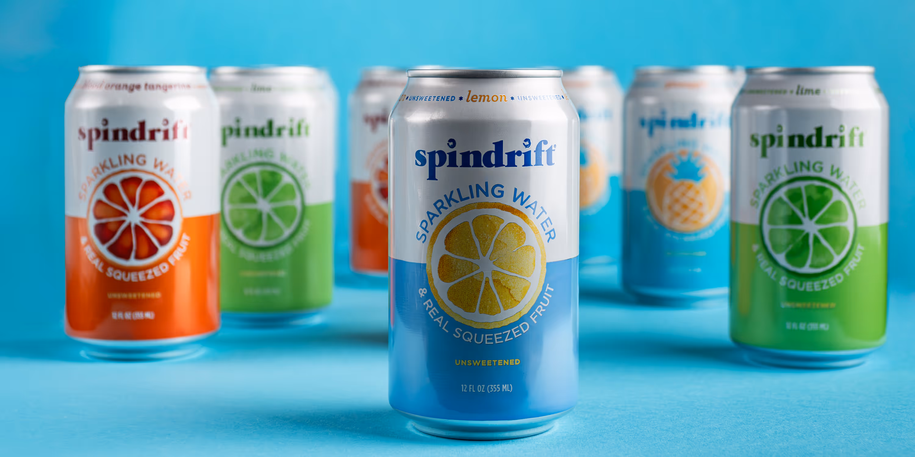
6) Color Blocking (Stop the Scroll in 0.5 Seconds)
Color blocking means using bold, simple color shapes behind or around your product. Think: one strong background color that matches your brand or flavor.
Why it works: It’s fast to read. High contrast pops on social. And it makes the packaging look sharper.
Best ways to use it:
- choose 1–2 colors max
- match background tones to flavor cues (lemon = warm yellow, mint = cool green)
- keep props minimal so color does the heavy lifting
7) Scale + Context (Show Size and Use Case Instantly)
Scale answers a silent customer question: “How big is this really?” Context answers another: “How does this fit into my life?”
Why it works: It reduces friction and makes buying easier.
Ways to show scale without clutter:
- hold the product in-hand (lifestyle)
- include a glass, plate, or common object
- show product in use (pour, scoop, peel, snap)
Extra credit: Turn this into motion: short GIFs or stop-motion clips make the story feel alive.
Ready for Product Photos That Convert?
If you want stunning, on-brand imagery without a messy process, we’ve got you. We handle the heavy lifting in pre-production, so the shoot day is smooth, fast, and built around your needs, whether you’re launching a new SKU, refreshing your Amazon images, or leveling up paid social creative.
FAQs
What is composition in product photography?
Composition is how you arrange the product, props, background, and empty space inside the frame. Good composition guides the eye to the label/benefit, makes the shot feel premium, and helps your product look clear and intentional—especially on mobile.
Which composition technique is the fastest “upgrade” for CPG photos?
The rule of thirds + clean negative space. Put the product slightly off-center, leave breathing room, and your shot instantly feels more modern (and more ad-ready with space for text overlays).
My photos feel “flat.” What’s the easiest composition fix?
Add depth + layering: place one element slightly in the foreground, keep the product in the mid-ground, and add subtle texture in the background. Even a small foreground blur (ingredient or prop) can make the product feel more 3D.